- Previous
- Next
Messaging App
Role
- UX and interaction design
- Prototyping
- Visual polish and refinement
What
An app that enables users to chat with their friends across different instant messaging platforms including Facebook, Skype, and Windows Live Messenger.
Goal
Build a first party Messaging app for Windows 8 that is beautiful, easy to use, and aligns to the overall OS interaction model.
Project details
I picked up design of the Messaging app for the final milestone of feature development. I was in charge of both the user experience and visual design through the initial public release and first update of the app.

Snapshot of the Messaging app UI when I joined the project
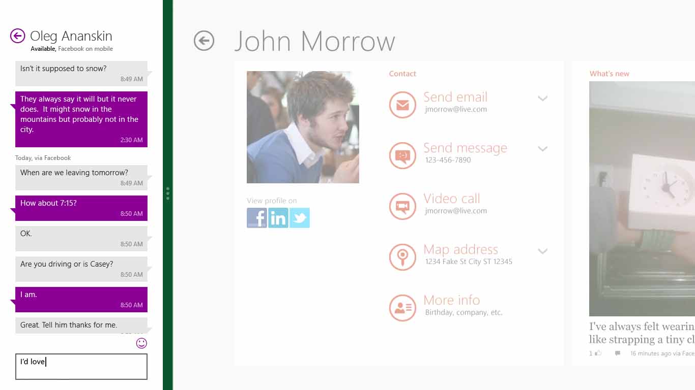
For the initial release of the Messaging app, I modified the original design to adapt to a variety of layouts including the 320px wide "snap" mode, portrait mode, and a scalable solution for screen sizes of 768px x 1024px and up. I also made changes to simplify the visual design of the app by cleaning up the layout, modifying the colors to better align to the OS palette, and reducing the amount of supplementary text on the canvas.

The "snap" layout, optimized for multitasking
From the interaction design side, my primary focus was improving the UX for starting a new conversation with a contact. When I joined the project, the way to start a new conversation was by clicking on a button located on the "app bar" (a Windows 8 taskbar that is exposed via right-click or a swipe up from the bottom of the screen). While this design fit well with the overall OS interaction model, results of usability lab studies showed that it was causing problems for users. First, people new to Windows 8 had trouble discovering the app bar and, even after they did, it felt cumbersome to have to open the app bar to do a fundamental task like starting a new conversation.

In early versions of the app, users started new conversations via a "New" button on the app bar
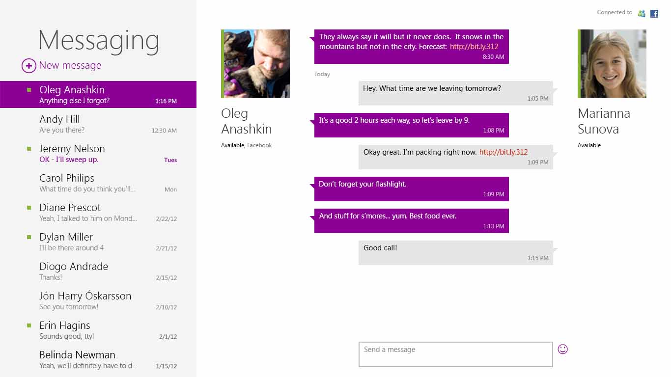
To address the discoverability issue we opted to move the button from the app bar to the canvas of the app. Lab results confirmed that this streamlined the interaction for starting a new conversation, but revealed additional issues with the design. We struggled with finding a good layout and label for this button within the existing design. In addition, in order to choose a person to chat with we were depending on the OS-provided contacts control. Unfortunately, this control was housed in a full screen window. The screen refresh that happened when moving from the Messaging app to the control was jarring for users and continued to make the experience feel cumbersome.

The initial public release of the Windows 8 Messaging app used an on canvas button to start conversations
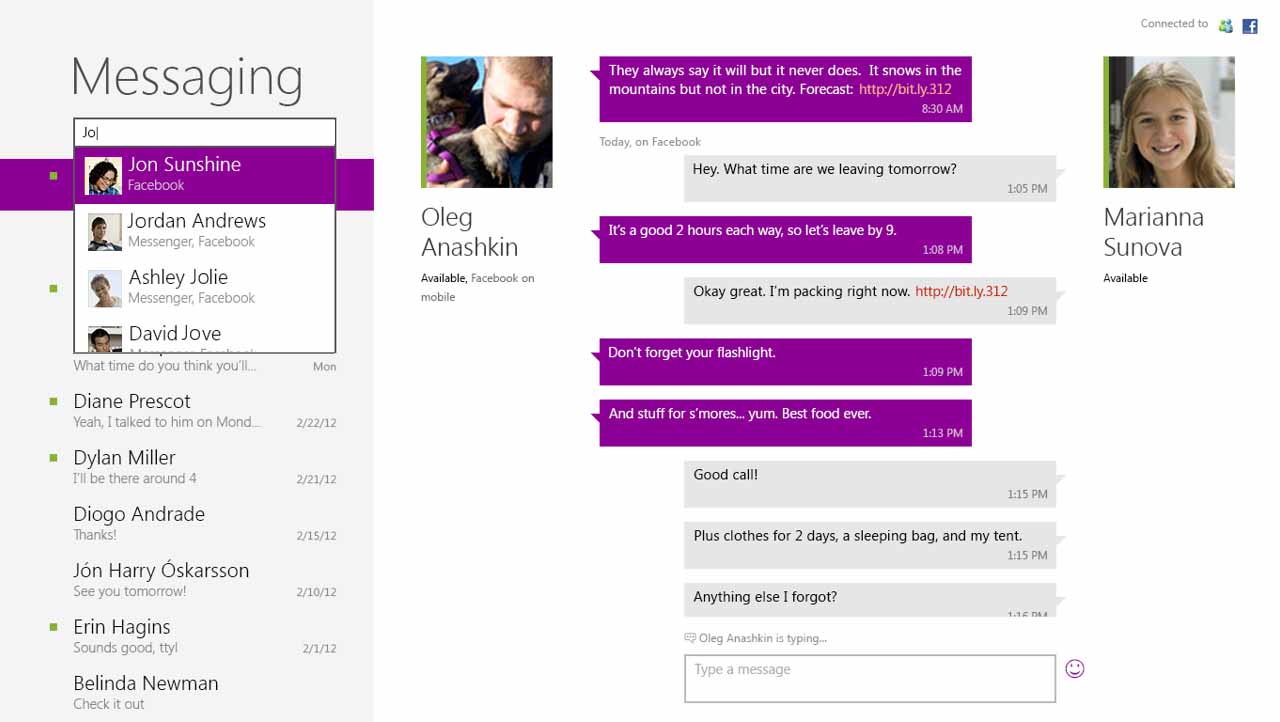
Our top priority in the first update to the Messaging app, released 3 months after the first public release, was to address the continuing concerns with this UX. We opted to replace the simple button and OS-provided contacts control with a custom word wheel contacts control, similar to what had already been implemented in the Windows Mail app. Usability studies confirmed that the new control solved our remaining issues with the UX for starting a new conversation, increasing both the discoverability and usability of the feature.

The first Messaging app update, including a contacts word wheel
