Windows OOBE
Role
- UX and interaction design
- Visual polish and refinement
- Prototyping
- Project management
- Cross-feature alignment
What
The "Out of the Box Experience" for customizing and configuring a new Windows PC.
Goals
Bring together the work of the many teams delivering code for this project to create a cohesive, streamlined experience that gets people using Windows as quickly and easily as possible.
Project details
I first picked up design responsibilities for OOBE during the second half of the Windows 8 release. When I joined the project, a basic page layout had already been finalized. I worked with the feature team to adapt this layout for different page types, addressing concerns such as modifying the layout to support PC manufacturer settings, incorporating non-standard controls (such as the color picker and accessibility controls), and scaling to multiple screen resolutions. I also worked with the writing team to clarify and streamline text throughout the UX.
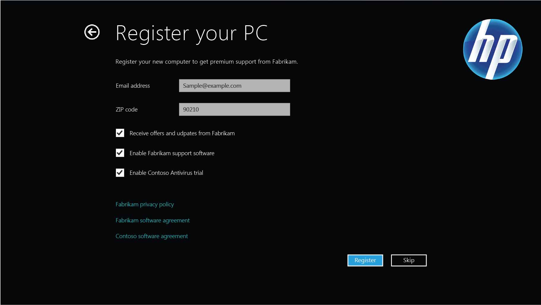
Customizable settings page for PC manufacturers
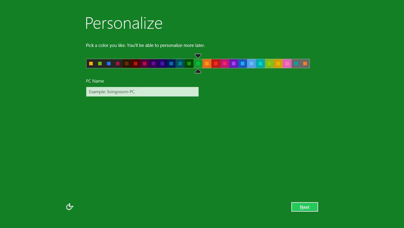
Personalizing your PC colors
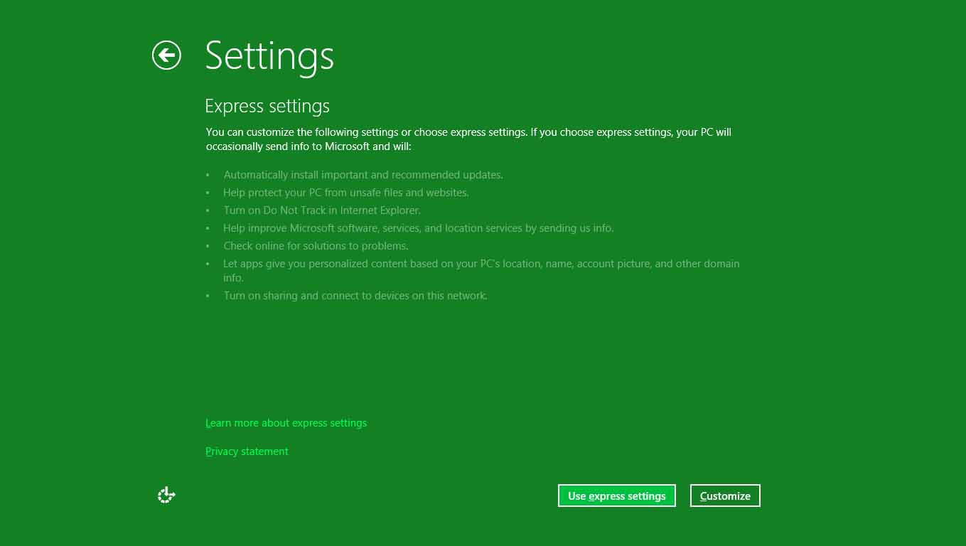
Express settings, a simple alternative to customizing many individual settings
Much of my time was spent designing integrated flows for "connected accounts" a feature that allowed users to sign in to their PCs with an email address and then roam data and account information across PCs securely. The UX for this feature was especially challenging as it involved live streaming of web data into a client-side experience with a very limited rendering framework.
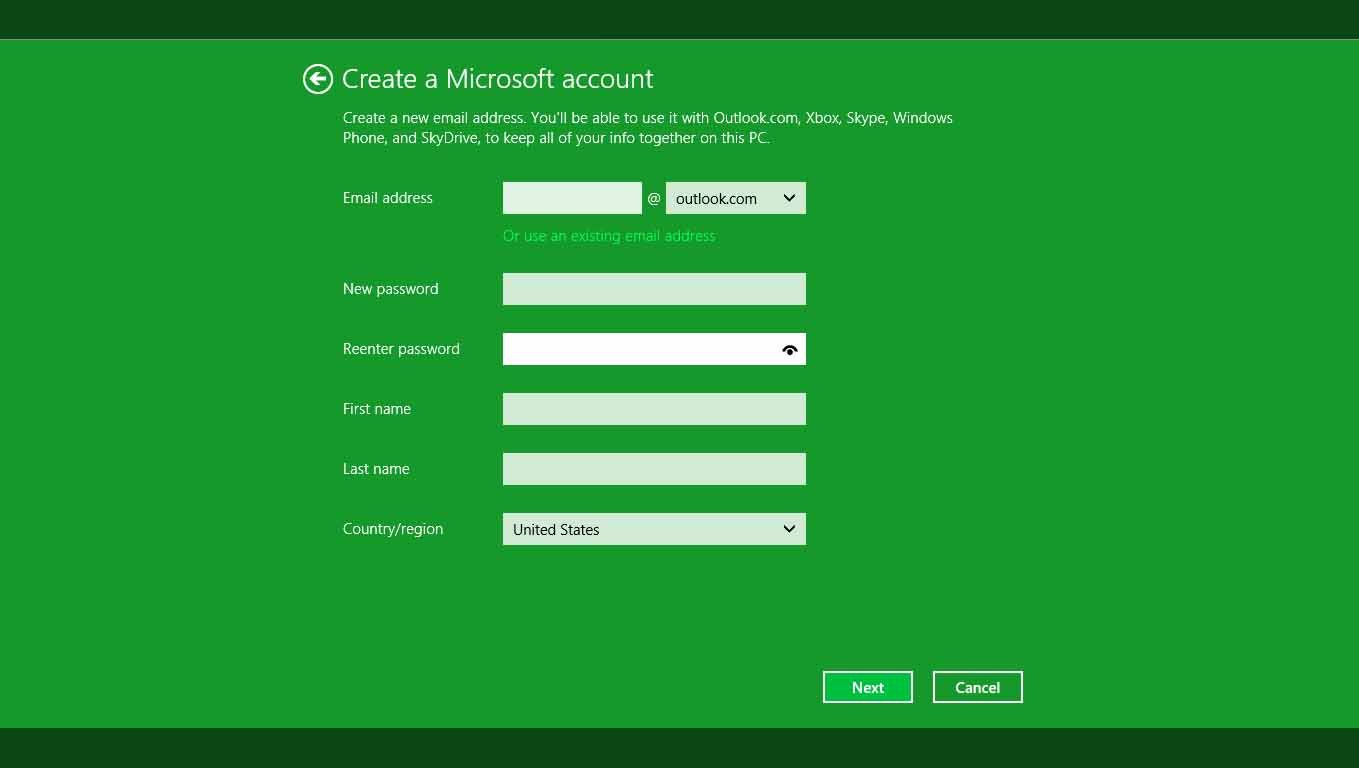
Creating a connected Microsoft account
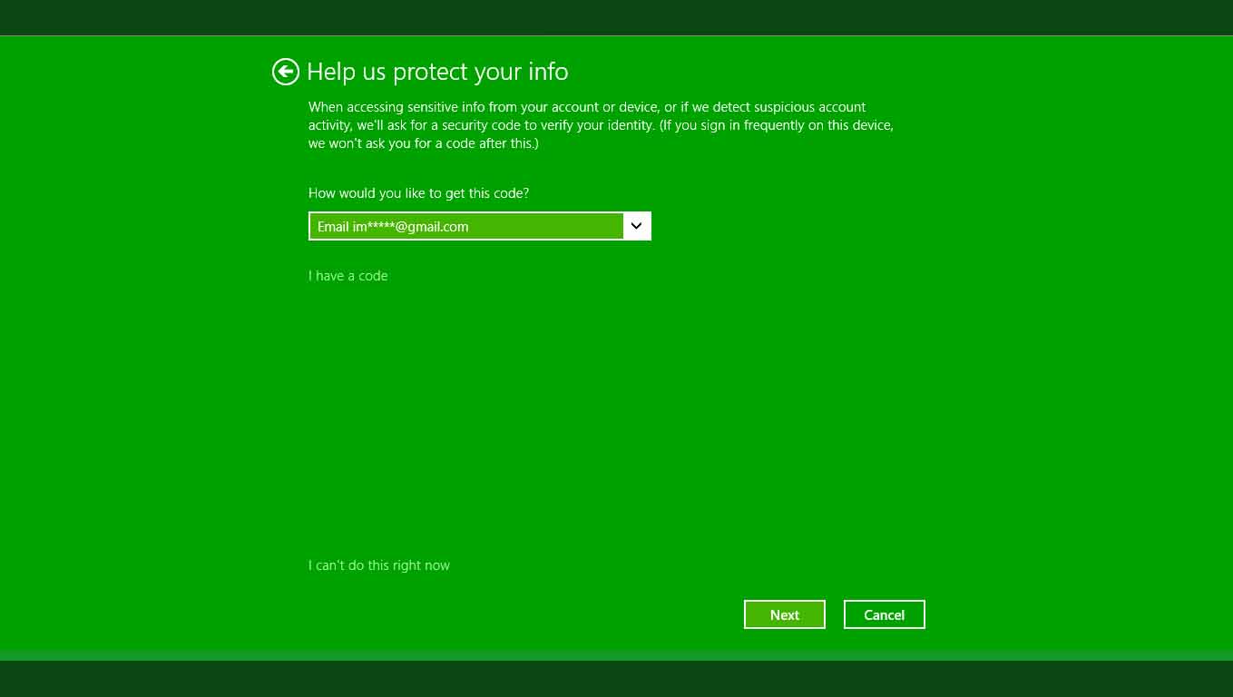
Two factor authentication provides added security
For Windows 8.1, I delivered targeted UX design updates and coordinated end-to-end alignment with the work from the 6 other designers and 7 feature teams working on different OOBE design updates that appeared in the release. The addition of new scenarios, account types, and upgrade paths in Windows 8.1 significantly increased the number and complexity of paths a user might traverse in OOBE. To ensure that we were still delivering a cohesive, streamlined experience for all users I coordinated a cross-team effort to map the entire OOBE UX. Analysis of this map resulted in refinements to both visual and interaction design as well as updates to the user interface text, creating a more consistent end-to-end experience.
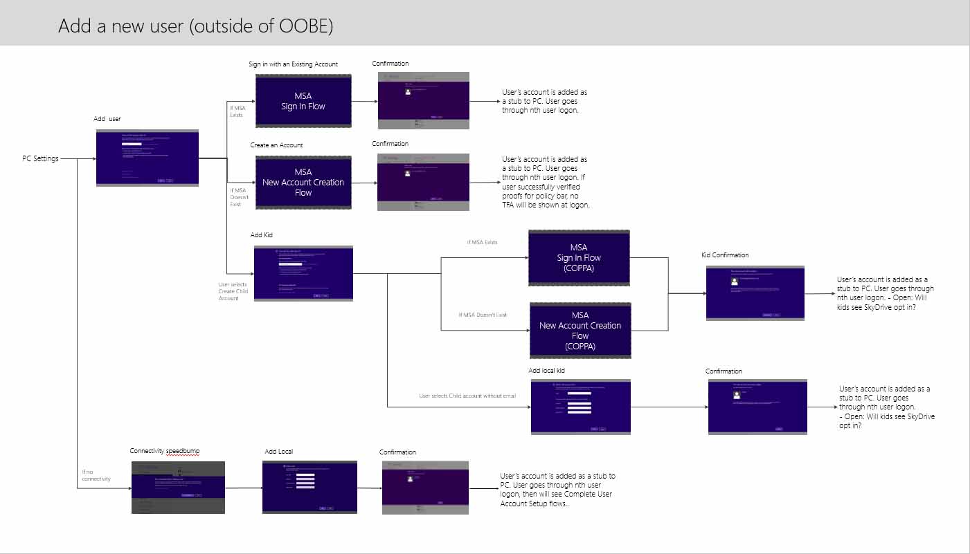
A small part of the Windows 8.1 OOBE experience map
