Windows Boot
Role
- Information architecture
- UX and interaction design
- Visual polish and refinement
What
A new information architecture, interaction design, and visual design for Boot, the UI used to configure, troubleshoot, and recover Windows prior to the operating system itself being loaded.
Goals
Bring clarity and a user-friendly tone to what had previously been a very technical and daunting part of Windows, and guide users to the Boot tools that are most likely to be useful and relevant.
Project details
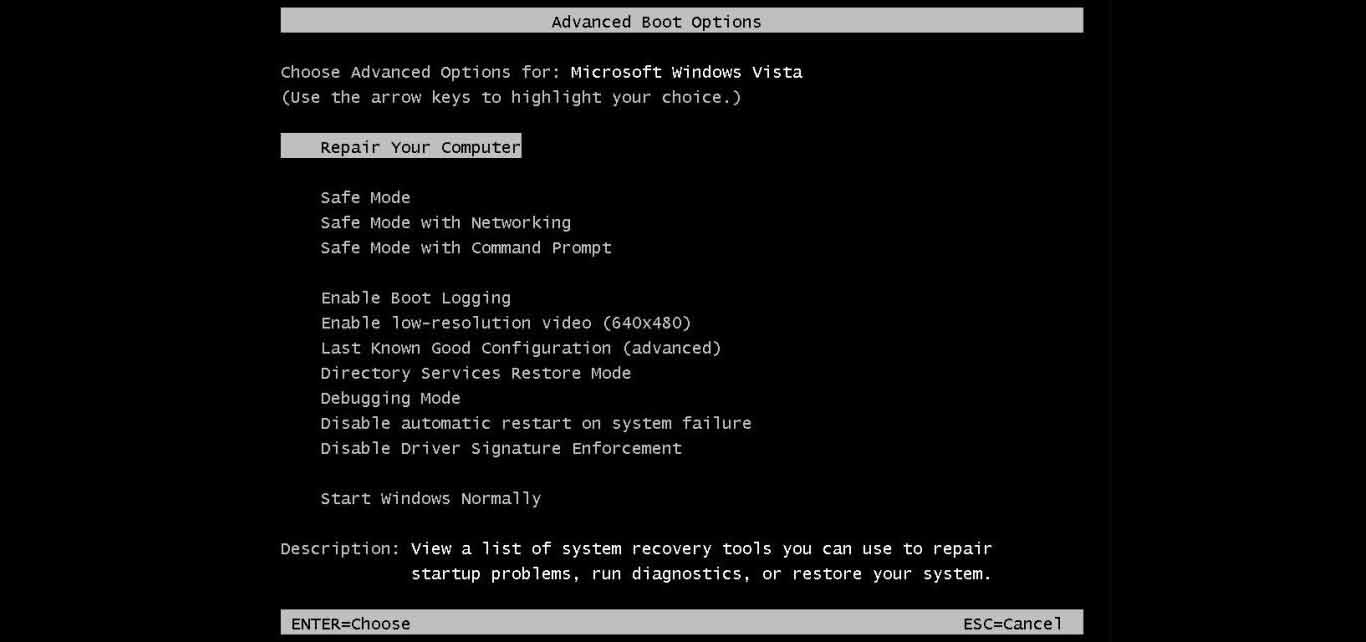
Prior to Windows 8, the Windows Boot experience had never had a redesign. It was composed of release after release of features, layered in different technologies, most of which followed a circa-1980 text console aesthetic from the MS-DOS period and often could only be navigated via keyboard. With Windows 8 moving to a more touch focused operating system and a new visual design style it was the perfect opportunity for a Boot makeover.

The Boot menu prior to the Windows 8 update
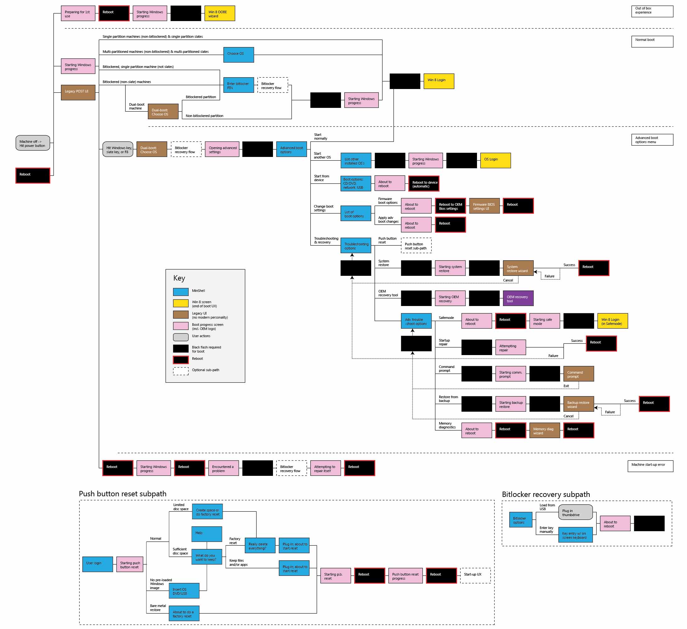
When I joined the Boot UX project the team had already been working for several months on the technical details of upgrading Boot, such as enabling touch input and creating a graphics infrastructure that could support modern visuals. However, the contents of the Boot UX had only been described in a piecemeal set of technical charts and graphs. To fix this, the first task I gave myself was to translate this technical documentation into a massive map that showed the different paths that a user might traverse in Boot and highlight key moments such as system reboots.

A giant map of all the required Boot UX pages and work flows
The new Boot UX was required to support the same scenarios as the old Boot experience, so I had limited control in terms of scoping the set of available options, but I was able to rearrange the pages and experiences. The new information architecture I designed made the most common tools easiest to get to and put more advanced and technical features deeper in the navigation tree which increased the likelihood people would use the most effective, least risky Boot tools first.
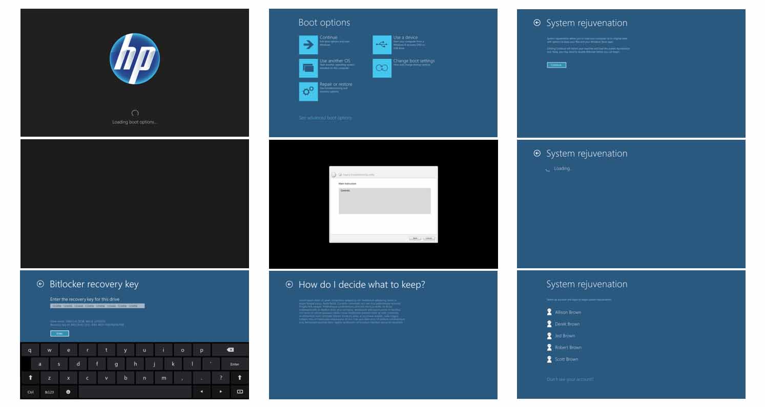
The initial Boot system contained dozens of different screens that the user might see, each with a different layout and set of interactions. I analyzed the requirements for these pages and identified 9 core page types that could be built. This scoped set of page templates simplified the Boot development and UX while still addressing all of the requirements for the different flows.

Layouts for a simplified set of nine different Boot page templates
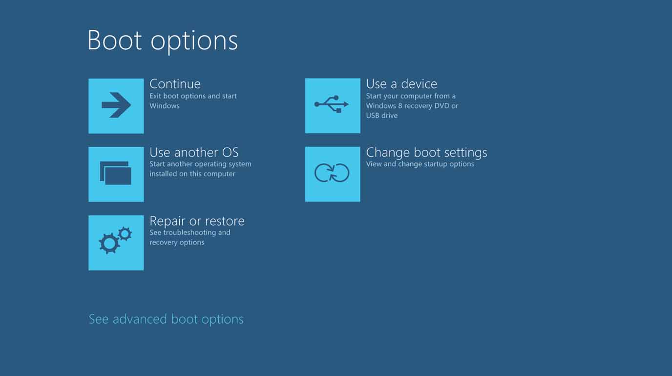
I created initial wireframes for the page types and then partnered with a visual designer to align these layouts to the overall Windows 8 visual style. The final version of Boot was more approachable and easier for both novices and experts to navigate.

Final visual design for the first page of the Boot menu
