Share Charm
Role
- Concept exploration
- UX and interaction design
- Prototyping
- Visual polish and refinement
- Cross-feature alignment
- Developer design guidance
What
A lightweight in-context platform that allows people to share content from within Windows to people and other apps.
Goals
Make sharing from Windows streamlined and intuitive, adapting to users over time and making it easy to complete the actions that they do most often. At the same time, giving developers the freedom to deliver sharing experiences tailored for their apps.
Project details
Our initial focus area for this effort was broad: integrating social and people related experiences into the core Windows OS. We were also working in a new UI framework, with a touch capable interaction model that was being designed in parallel with our feature area. As a result we did a lot of initial sketching to explore the scenarios and interaction mechanisms we wanted to support.
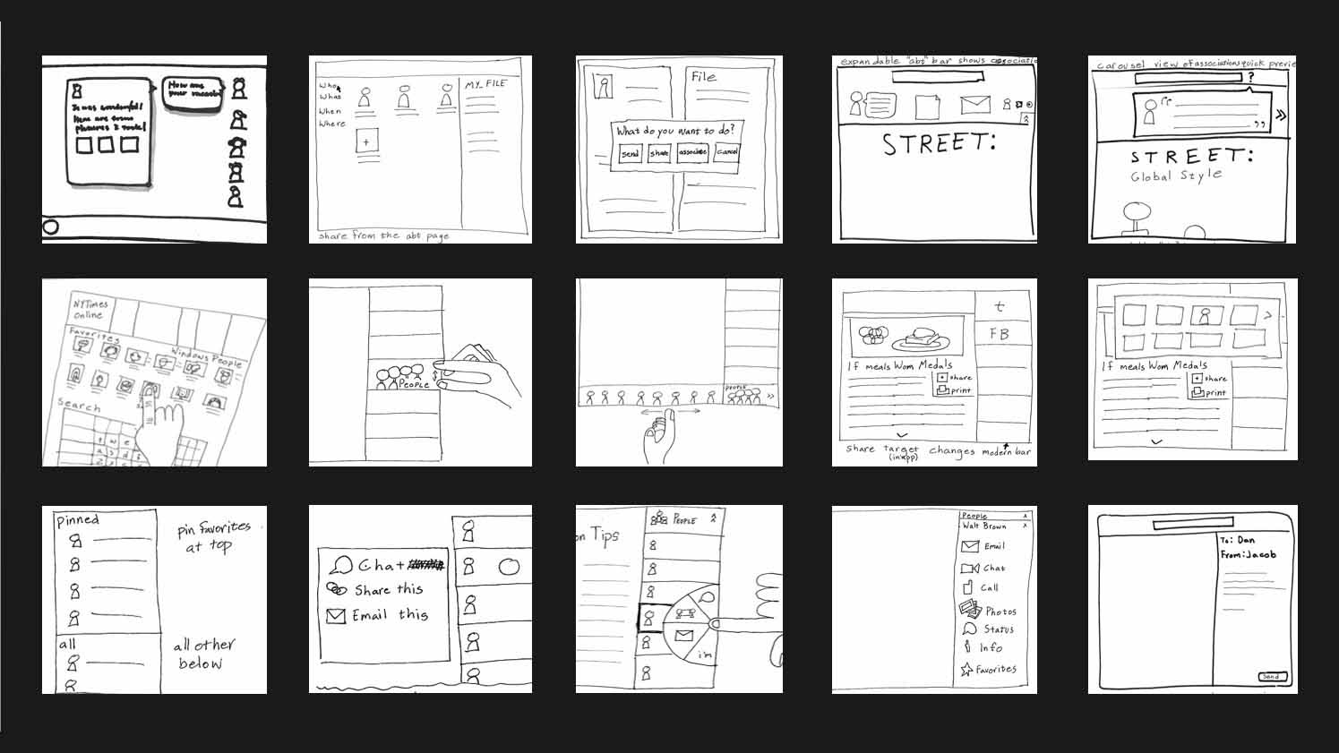
Early concept and interaction explorations for Share
We ultimately settled on an app-focused platform model for the Share Charm. It works by bringing together three pieces: source apps, the Windows Share UI, and target apps. Windows is the glue between source and target apps that enables them to talk to each other.
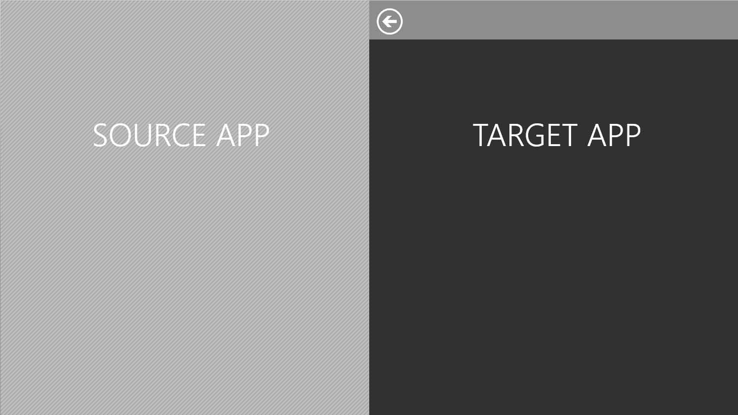
Source apps and target apps work together with Windows to make sharing possible
A source app is an app that contains content a user wants to share. When people find something to share (like this Disapproving Rabbits site) they open the Charms Bar and select the Share Charm. The source app creates a data package of information about the shared item (for example, a website url, the title of the page, and a thumbnail) that is then passed to Windows.
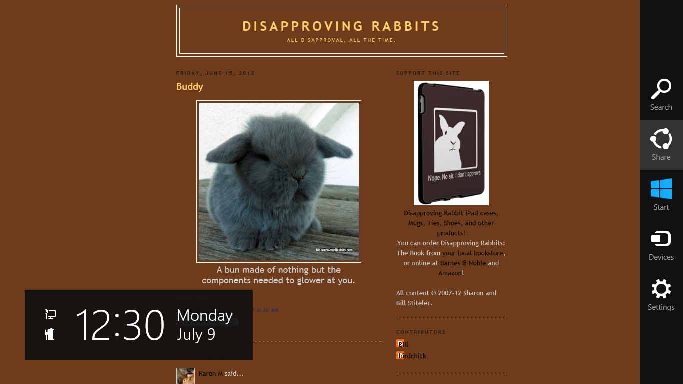
Users access Share via the Charms Bar
Next a user decides where to send the selected information. One of our goals was that Share would adapt to users over time, making it quick and easy to complete commonly repeated sharing tasks, such as sending an email to a close friend or posting pictures to a specific album on Facebook. We spent a significant amount of time exploring different interactions to enable these sharing shortcuts and partnered closely with the Windows Research team to evaluate design alternatives in the usability lab.

A walk through of a radial menu design for selecting Share shortcuts
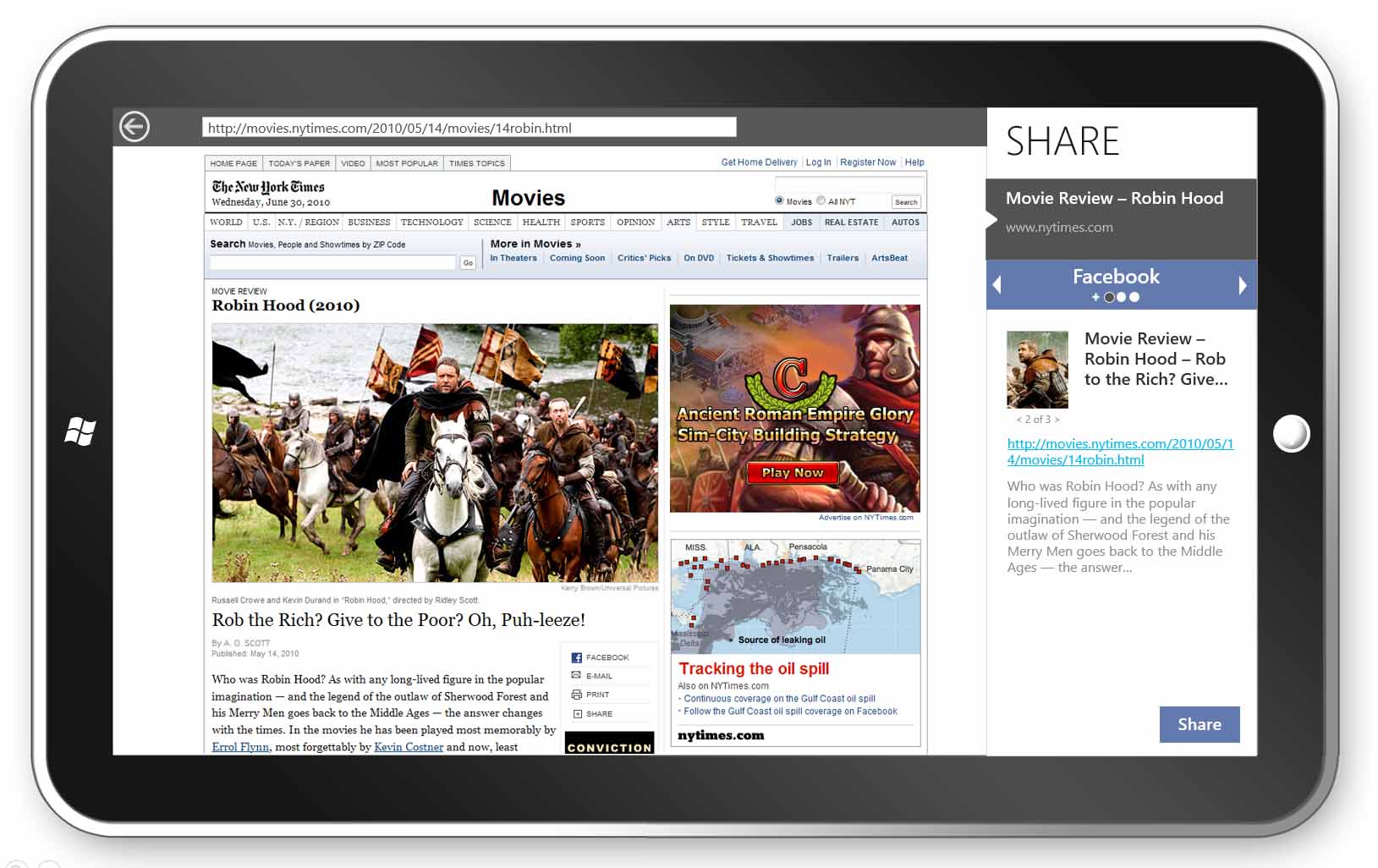
A lo-fi prototype of a carousel-style control for Share shortcuts
We settled on a simple design composed of a single list of targets housed in the Windows Share UI. The top part of the list shows a brief preview of the content to be shared, followed by a list of a user's frequent sharing actions and a list of relevant target apps sorted by frequency of use.
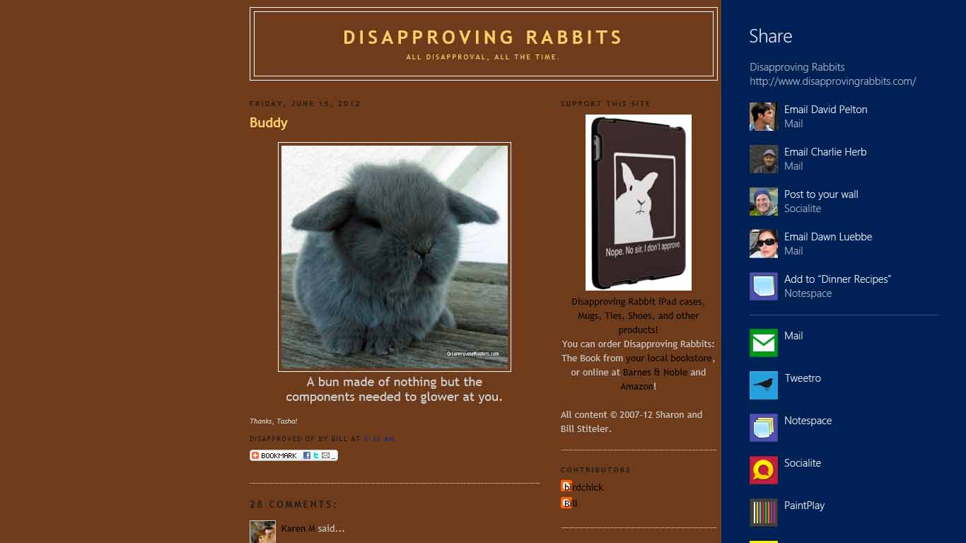
Users choose where to send content from a list of common Share actions and target apps
Finally, the user sees the target app UI. A target app is an app that a user selects as the destination for the content being shared. The target app reads the data package contents and creates a unique sharing UI — displayed within the flexible Share canvas — that adheres to their app brand and experience. I designed the Windows Mail target app and advised other in-house app teams on developing good target apps. I also partnered with program managers in defining design guidance for third party app developers shipping Share source and/or target apps.
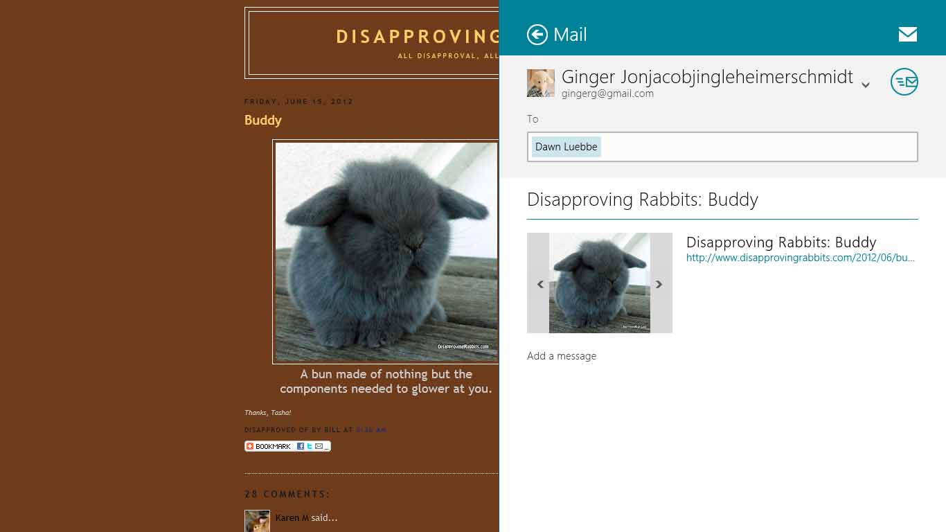
The Windows Mail target app
The Share UI also provides support for displaying progress and errors for previously shared content.
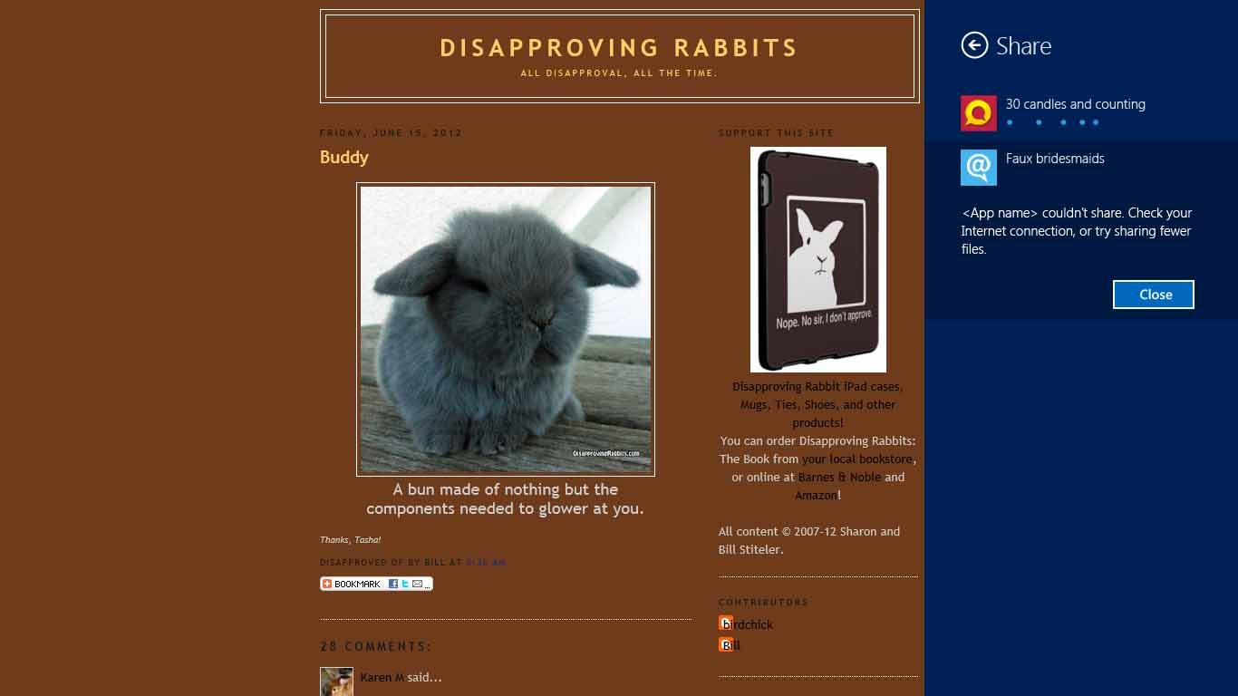
Progress and errors shown in the Share UI
In parallel with the development of Share, three other teams were developing flows that would be available from the Charms Bar: Devices, Search, and Settings. In using early versions of Windows 8 it was clear that these flows were being developed by four different teams with little design alignment across the boundaries. To address this problem, I brought together all the Charms designers and partnered with them to bring better consistency to the visuals and interactions in the different flows.
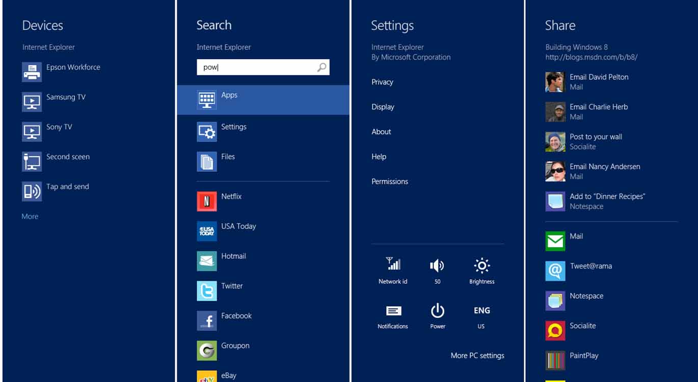
Consistency across the four Charms: Devices, Search, Settings, and Share
